
Attendance Insights
TeamSense UX


Process

Early Concept Charts
I ideated through many data options and chart displays for attendance trends based on prior client sessions. We showed charts to 3 client groups before narrowing it down to the MVP set with some improvements.

Quick Stats
Quick stat cards along the top of the page give management an idea if they are trending up or down, as well as overall attendance rate, and employees to celebrate for having perfect attendance.

Simple Trend
Previously, clients could only see a single days data at a time unless they exported to Excel. While simple, this chart provided a lot of value in seeing what times of year absences pick up so that management can plan ahead.

Charting Status
This chart shows a similar trend as above, while also breaking down the statuses that were used.
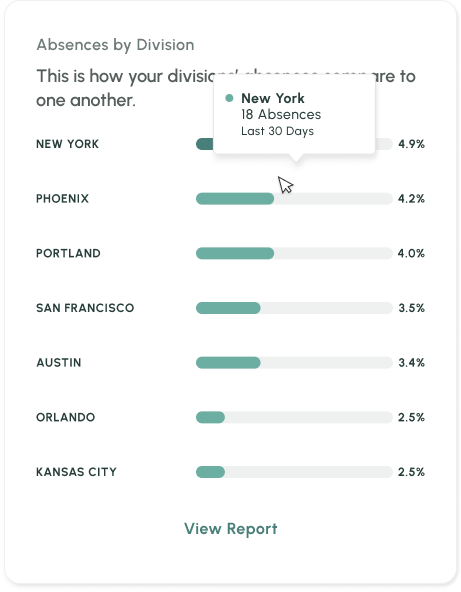
Ranked by Most Absent
Originally we had the Absences by Divisions displayed as an area chart, but it was too complex for client with over 8 divisions. We changed it to this chart type and removed a chart showing Managers who had the most absent employees, as clients said this was not information they needed.

