
Vendor Analytics
ClickBank UX
CONTEXT
Many of the charts our clients used on a day to day basis to track their sales analytics were hosted off platform and fed via an API. The ones that were available on platform were Flash. We decided bring those charts on platform and level them up with a modern design and charting library.
I worked with the VP of Product and our Business Intelligence Team back and forth on possible versions of each chart. We started the process internally with BI since they had a deep understanding of what information the clients needed to be able to get from the reports.
Ideation


Reporting on subscriptions is critical for vendors to track how well their subscriptions are selling, how long customers are keeping with them, and track at what point the subscriptions are cancelled.
The original reports were not separated by use case from the larger reporting library. They were all single line charts combined with tables that had very small typography. The charts were also using terminology that was confusing to the clients.
At the beginning of the project we decided to create several reports for Subscriptions, broken out by use case, rather than having one overly large report the user had to filter and sort.
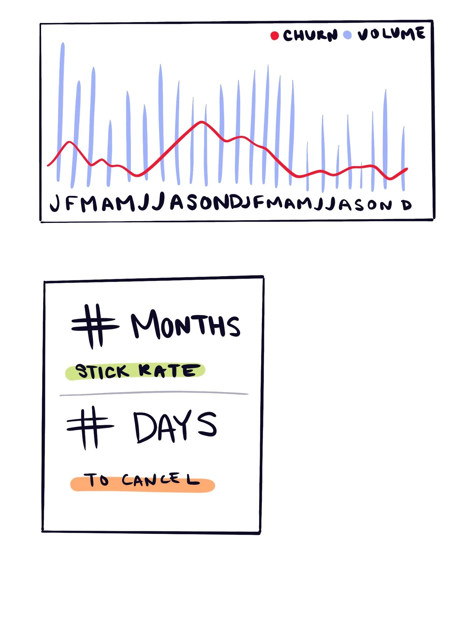
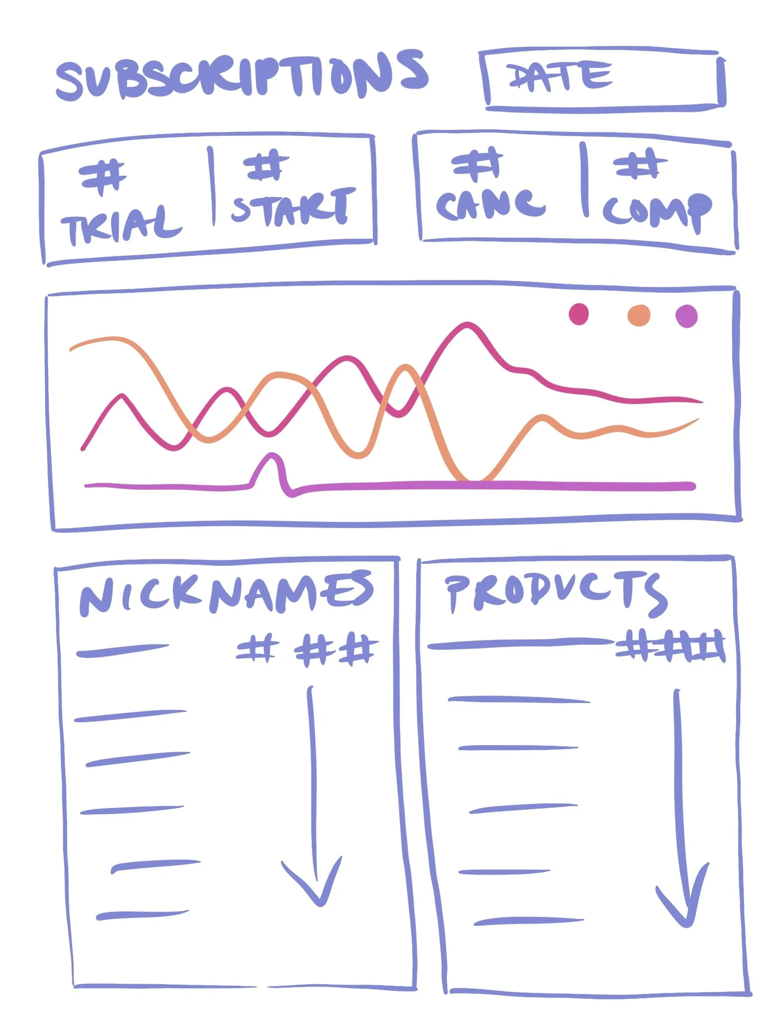
I started with sketches to see how we could fit the relevant information to each report on the page in a useful way.
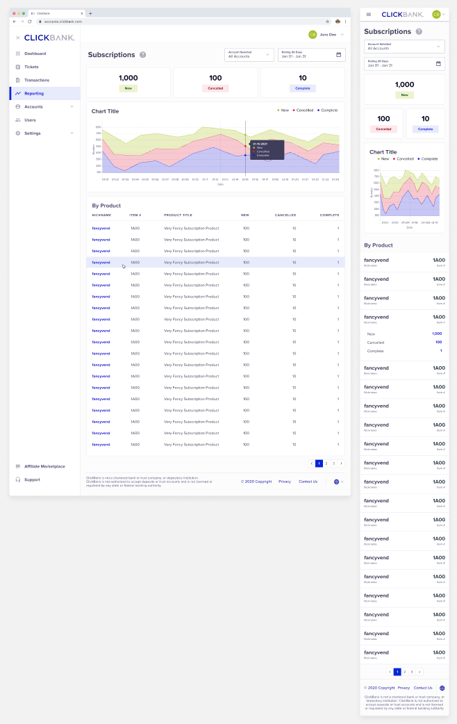
Originally in the sketch I had stuck to a line chart, however during the design phase it was clear that an area chart was easier to read. The data points virtually always fell into a pattern of New (Green) having the highest numbers, Cancels (Red) being in the middle, and Completes (Blue) being the lowest, so this chart type was definitely more ideal.
Significant improvements were made to overall readability and aesthetics from the original reports. Reports were also designed to be mobile responsive, which was a new feature for them.
By moving the reports up in navigation from the sub-account to the main account level, users were able to see their Subscription Analytics for all of their accounts at once rather than having to go to each individual one. They were given a drop down filter to control whether they were viewing all accounts or a single specific account.
Ideation
An In-Depth Look at Subscriptions
Design


Users were overall very pleased with the new reporting and had many happy comments they left on our Facebook group and told to their account managers.
“This is a HUGE improvement and very much appreciated!” — Vendor Quote
“Love where this is all going!” — Vendor Quote
The updates were also vastly helpful to our internal account managers in helping their clients improve their subscription funnels.
Implementation
Final Reports

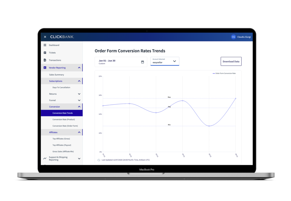


Plans for Dashboard to Tie All Charts Together