CASE STUDY
Increasing Save Rate by 30%+
An acquired retention tool let merchants set up cancellation save offers, but editing was slow and confusing. We redesigned it from scratch, and within a month save rates nearly quintupled.

Icons

Interview Transcripts

Personas
Case Studies
Competitive
Analysis
PROBLEM
Merchants Could Not Edit Offers With Confidence
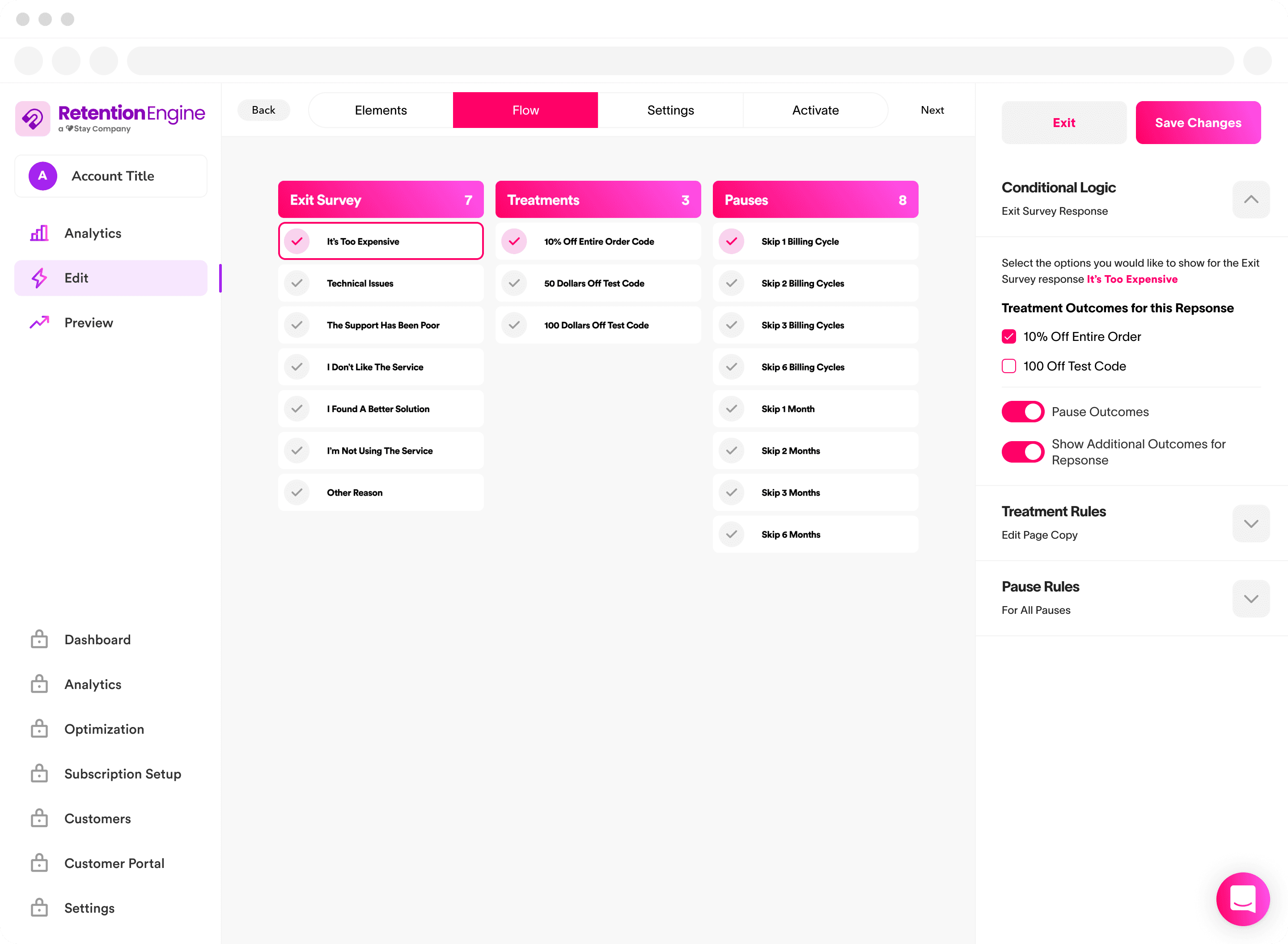
RetentionEngine let merchants build a survey to show customers trying to cancel offers like discounts or changing products, but the tool was opaque and settings were buried.
The editor spread settings in hidden menus and took an average of over 9 minutes just to save one change. Merchants often weren’t sure their edits had actually worked, so they’d refresh, second guess themselves, or open an Intercom ticket to check. Merchants could only show one offer and logic was difficult to set up and confirm.
Support volume kept climbing while engagement with the tool itself was steadily declining. We needed a faster, clearer editor that merchants would trust and want to come back to.
RESEARCH
Watching Where Merchants Got Lost & When They Sought Support
I pulled session recordings and Intercom tickets from the prior 60 days of Retention Engine usage and used our Claude/Gong MCP to scan our CX call transcripts for conversations about RE.
One recurring complaint was that the flow editor was unclear to see what path end customers would actually go through. Watching sessions it was also clear to see that merchants were getting lost in the maze of side panel edit states.
Several didn’t realize a setting had saved until they manually refreshed the page, which lined up with the long average time to convert I saw in the data.
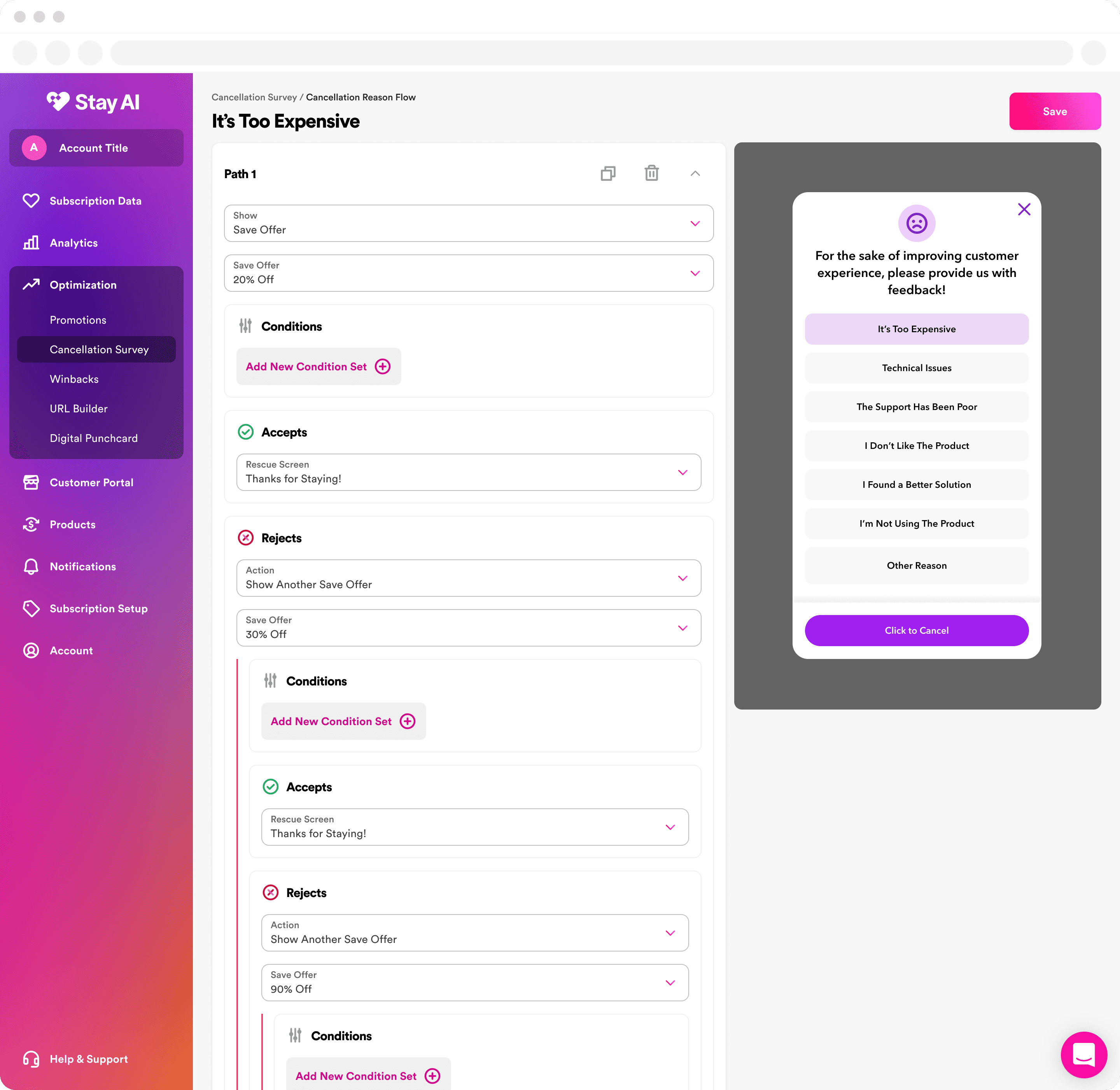
There was no ability to see what the survey looked like, and merchants were limited to showing one offer per reason, when they wanted the ability to show multiple enticements to stay subscribed.

TESTING
Validating Concepts Before It Shipped to Everyone
Researching our competitors, we found that universally their cancellation surveys were far more restrictive than ours in feature set and flexibility. No two competiors in the industry had solved the problem in a similar UX pattern, all were unique. We had heard that the flow chart type pattern from one competior was easy to understand, but was rigid and ultimately didn't allow for the flexibility desired.
As a product team we discussed several patterns and settled on designing and testing two that we felt were strong. One used a similar but improved form based layout. The other combined the survey builder and the flow editor into a single canvas with inline A/B testing controls. Both options added a preview state, a visual library of screens, and corrected baseline UX patterns.
Before rollout, we tested the two prototypes with a small group of beta merchants.
The unified canvas won clearly in both task completion time and confidence ratings. Merchants finished setup faster and said they felt sure their changes had saved, which shaped the final design we shipped.
RESULTS
Merchants Adopting,
Save Rates Climbing
Just over 30 days post launch, the early data already showed a real shift. Not only were merchants having more success setting up cancel surveys, the surveys they were setting up were better. Most surveys went from an 8% customer save rate to 40% save rate just because merchants were able to clearly customize each path.
Save rates were up significantly across merchants, return visitors were saving changes far more often, and the time it takes to open the editor and save a change was nearly been cut in half. Adoption was already more than halfway to the typical SaaS benchmark for a brand new feature.
30%+
Average Lift in
Save Rate Over RE
42%
Average save rate across all live merchants
4 min
Faster to open, edit, and save a change
16%
30 Day Merchant Adoption Rate
