CASE STUDY
Adding Daily Delight
Redesigning attendance tracking for manufacturing companies to reduce mental load, track trends in absenteeism, and add delight to a daily task.


CONTEXT
Tracking Absenteeism in Manufacturing
The primary feature of TeamSense was for managers to track the attendance of their staff on a day to day basis. In manufacturing often a certain level of staff needs to be in attendance for the floor to operate. The current page for tracking this was lacking, requiring some mental math, low visuals, and only one day was visible at a time.
Our goal was to allow managers to see their attendance at a glance and to track trends over time, along with adding delight.
RESEARCH
User Research
Our leadership team, who founded the company with an extensive history of working in manufacturing, provided some initial assumptions to kickstart the design process.
After ideation and creation of initial concepts for conversation points, I conducted client interviews where we walked through the charts together to get an understanding of what kind of data would be most helpful to them. They explained common patterns they noticed, and what kind of displays would help them back up their casual observations.
Based on user feedback I narrowed down the initial set of data we would provide. I also decided that redesigning the current attendance summary by day to be more visual and adding a new page for trends would be best for task focus.
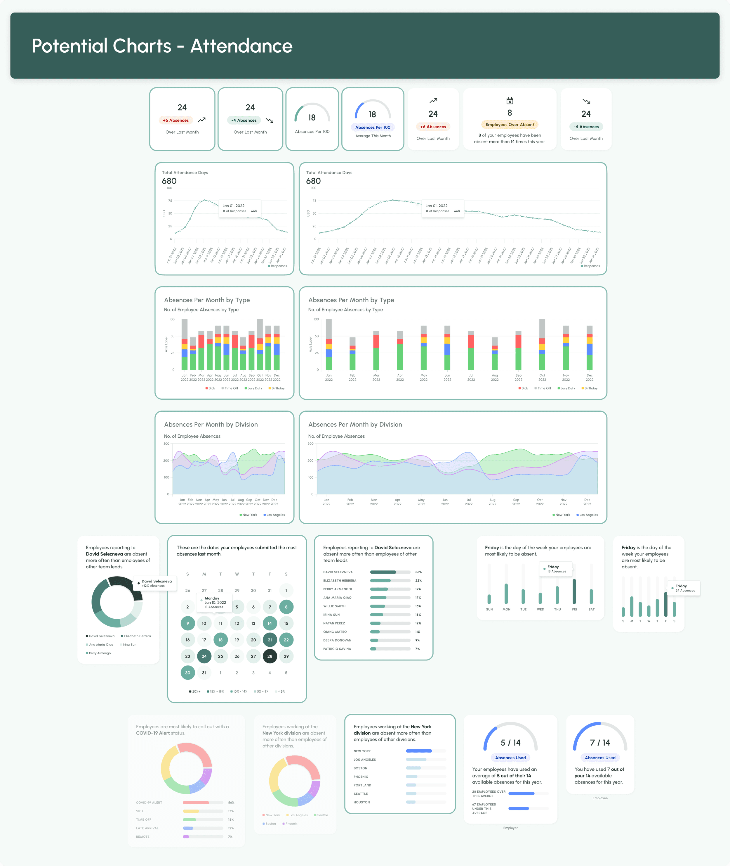

UX Improvements Driven by UI Changes
The visual of an interface is the first layer that is absorbed by a user. It drastically changes a user's perception of how useful and functional an application is. For this redesign, each design decision was driven by what would make it more enjoyable and usable for the managers using the app.


FOCUSED TASKS
Divided mobile layout allows for manager task focus on the go and higher visibility of their team.
Most of the manufacturing managers using TeamSense were on the floor with their employees rather than behind a desk. I designed mobile-first so that these on-the-go managers always had access to the data they needed.
Rather than cluttering all of the information on a single page, I designed a split layout for task focus. Managers who wanted a quick view of their head count and managers looking at specific absences needed different information.


INCREASING SCAN-ABILITY
Visual comparison of bars is a lighter mental load than comparing numbers directly, and automatic calculations add more value.
Highlighting important numbers like the number of staff and what percentage of the team that is help managers make quick assessments of if calling in more staff is necessary. Balancing negatives with a positive statistic of how many employees are maintaining perfect attendance makes a stressful task less so.
Saturated colors help draw attention where needed and make the view less washed out, better contrast highlights content and draws the eye.


EASIER READING
Using shaded backgrounds, subtler typography can be used while increasing readability.
Cards detailing the exact reasons for a employee’s absence or the details of their COVID-19 Positive status were difficult to read with large blocks of all caps styling and minimal visual distinction between sections.
Readability was improved by updating typography and adding shaded background to highlight answers, rather than questions.

SWEETER SYNCING
An animated sync button I created to add some delight to a dull and repetitive task.
Sometimes, its the little things that make an experience feel sleek and engaging.

CELEBRATING WINS
Managers see confetti when they have zero absences for the day, encouraging them to celebrate with their team.
This feature was implemented knowing that it would be seen infrequently. However, that made when it appeared all the more special for the end user and a true celebration.

SIMPLE TREND
Previously, clients could only see a single days data at a time unless they exported to Excel.
While simple, this chart packed a punch in value add, allowing managers to see trends that were previously hidden.

TRENDS BY STATUS
See status spikes over time.
This chart shows a similar trend as above, while also breaking down the statuses that were used. Trends may vary by season, sick and car problems rising in the winter while advance time off requests may spike in the summer.


TRENDS ACROSS LOCATIONS
See if trends are universal or based on location.
Leadership teams wanted data on if certain cities or plants had differences in absenteeism rates. Along with being able to filter by location to see specific data, the starting page had stats to give a scent on which locations to look at.
Originally we had the Absences by Divisions displayed as an area chart, but the visual got crowded when there was over 8 divisions. During user interviews, clients indicated this chart type was clearer for them.
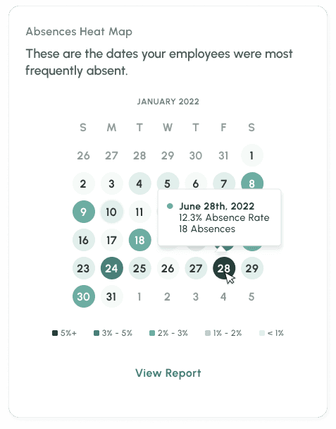
HEAT MAP CALENDAR
Identify unusual spikes in absenteeism quickly and notice if particular days of the week are more common to call out.
A funny insight to the inception of this data card, was that a manager in the past noticed there would be a large number of call outs on Mondays, but not all Mondays. Eventually, management realized the connection between local football games and the call outs. This card was designed to spot if calendar events were the cause of absence spikes.